
In 2010, Akinox was already revolutionizing virtual care in Canada’s Far North by bringing health care closer to patients in remote areas. More than 10 years later and a COVID-19 pandemic, Akinox continues to digitize, automate and modernize the healthcare system using technology with the goal of facilitating access to care for patients and simplifying the day-to-day administration for healthcare professionals.
To better reflect its vision, values and numerous projects, Akinox wanted to evolve its brand image. Modern, simple and innovative, Akinox’s new visual identity illustrates its expertise and its mission to put technology at the service of health for better patient care in Canada and internationally.
For a Modernization of the Akinox Logo
Did you know that the old Akinox logo was created in 2017 in-house by an Akinox talent? Five years later, it’s time to rejuvenate the logo by adapting it to current design trends such as the use of rounder fonts, the use of lower-case letters and the trend to simplify fonts for better readability.
The three main objectives were to:
- Modernize the logo
- Add an iconography to differentiate us
- Have a visual identity that looks like us. Our company has evolved a lot over the last few years, so we wanted an image that reflects our current identity.

A Specification that Looks Like Us
We started by identifying what was important to us as a company and came up with keywords that were like us based on:
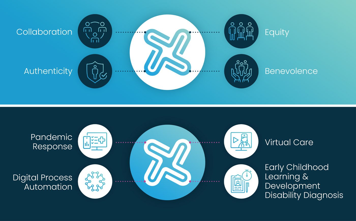
- Our 4 core values: authenticity, benevolence, collaboration and equity
- Our field and industry: technology and health
- Our strengths: agility, innovation, efficiency and creativity
- What differentiates us: humility and humanity
Expectations for the new logo were high; it had to be modern, dynamic, up to date, professional, distinct and above all represent Akinox. We wanted a symbol that represents movement, to illustrate our work in modernizing the healthcare system; human, because the patient is always at the center of everything we design and is at the heart of our decision-making; and that illustrates connections, because we link patients, healthcare professionals and different institutions together for simplified and more efficient communication. We also wanted colors that represent our industry and our field, health and technology, colors that are vibrant and modern to represent our dynamism and our innovations and finally colors that inspire trust, partnership and respect which are fundamental elements in all our collaborations.
A New Visual Identity that Represents Us
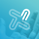
We had an important assignment and put our creativity and internal talent to work to create our new Akinox logo.

THE MEANING BEHIND THE SYMBOL
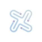
HEALTH
Our symbol also resonates with the health symbol. It is a deconstruction to represent the fact that Akinox is transforming the way things are done in the healthcare network by breaking down silos so that information flows more freely.

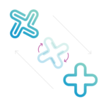
PINWHEEL
Akinox is a breath of fresh air for the healthcare community. Our solutions and technological achievements are propelling the healthcare network into the future. The company offers a breath of fresh air and a flurry of innovative ideas to improve the way the healthcare system works.

HUMAN
The center of all decisions and the mission of Akinox is the human. Whether it’s the patients in the healthcare network or our employees, the human element is fundamental and cannot be overlooked in the new Akinox symbol.
OUR VALUES AND PILLAR PROJECTSFinally, we also wanted to illustrate our 4 corporate values, namely collaboration, equity, authenticity and benevolence, since they are very present in the company’s internal and external communication, as well as our 4 flagship projects, namely the Pandemic Response, Virtual Care, Digital Process Automation, and Early Childhood Learning & Development Disability Diagnosis. While Akinox is working on other equally important projects, these four key projects are what inspired us to create the new symbol.
Conclusion
We were eager to share our new visual identity with you. Without the collaboration and benevolence of our partners and collaborators, none of Akinox’s achievements would be possible. We wanted a new brand image that represented not only Akinox, but also all the stakeholders in our various projects in an authentic and fair way, because together we go further.